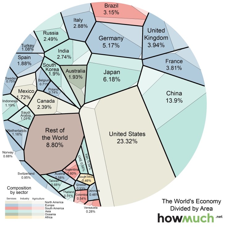
The graphic above (Voronoi diagram) represents the relative size of each country’s economy in terms of nominal GDP: the larger the area, the larger the size of the economy. The areas are further divided into three sectors: services, industrial, and agricultural. The US economy is mostly composed of companies engaged in providing services (79.7% compared to the global average of 63.6%), while agriculture and industry make up smaller-than-average of portions of the economy (1.12% and 19.1% compared to averages of 5.9% and 30.5%).
Tags: globalization, industry, economic, visualization.
Source: howmuch.net


Leave a comment