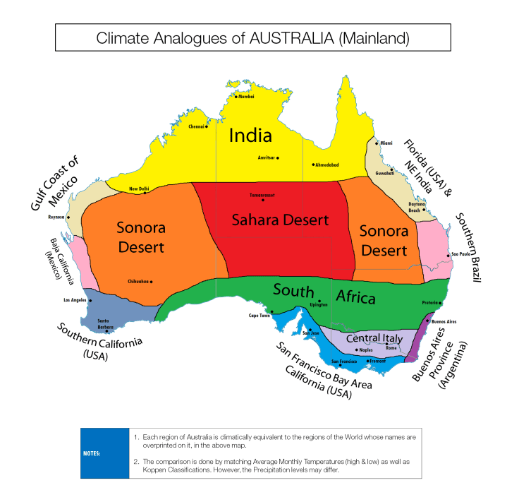
“Triton1982 makes maps by comparing each of the city’s highest and lowest average temperatures against the Koppen classification system.”
Source: www.triplem.com.au
Many maps are shared on Reddit, and this series of maps help make some far off places easier to relate to. I think these cross-regional comparisons can also help students also see that countries can have a great degree of internal variety.
Tags: Australia, Oceania, mapping, visualization


Leave a comment