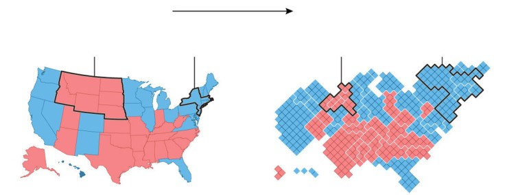
In 2012, 160 counties cast about the same number of votes as the rest of the country. But, your run-of-the-mill election map won’t show you that.
Source: www.washingtonpost.com
This is nothing new to most visitors to this site, but every four years we have a wonderful teaching moment to show how population density can change our interpretation of a map and the meaning of the data embedded in that map. I preparation for next week, this article for the Washington Post as well as this one from the New York Times should help get students be better prepared for the onslaught of maps that we know are right around the corner, to properly assess and contextualize the geographic content in these maps.


Leave a comment