“Repurposed NASA maps show the racial diversity (and segregation) of the United States in more detail than ever before.”
Source: geographical.co.uk
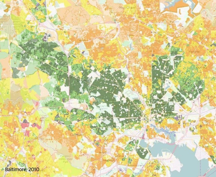
This interactive map of population density in the United States also shows ethnic categories as defined by the U.S. census. Please explore this map at a variety of scales and in distinct locales.
Questions to Ponder: Is this a map of ethnic diversity patterns or is it a map of racial segregation? How come? Is there additional information that you would need to decide? This review of the map on Wired and Atlantic Cities described this map as a map depicting segregation: why would they say that?


Leave a comment