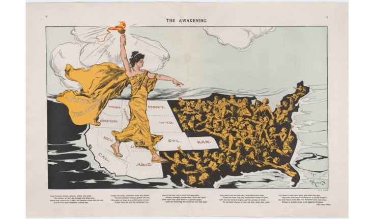
“This is a collection of ‘persuasive’ cartography: more than 800 maps intended primarily to influence opinions or beliefs – to send a message – rather than to communicate geographic information. The collection reflects a variety of persuasive tools , including allegorical, satirical and pictorial mapping; selective inclusion; unusual use of projections, color, graphics and text; and intentional deception. Maps in the collection address a wide range of messages: religious, political, military, commercial, moral and social.” SOURCE: Cornell University Library
This is a fantastic collection of historical maps. I especially enjoy the rhetorical and overtly persuasive quality of the maps in this collection. Too often, we assume that maps convey data and information from a strictly neutral position. Just like every news article, how the information in a map is arranged, selected, and framed is helpful in evaluating the usefulness, important, and accuracy of the information that is being presented.
GeoEd Tags: cartography, visualization, mapping, art.


Leave a comment