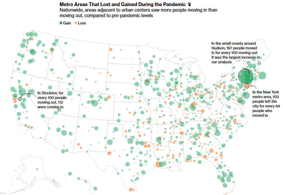
“A year into the Covid-19 pandemic, after much speculation about emptied downtowns and the prospect of remote work, the clearest picture yet is emerging about how people moved. There is no urban exodus; perhaps it’s more of an urban shuffle. Despite talk of mass moves to Florida and Texas, data shows most people who did move stayed close to where they came from—although Sun Belt regions that were popular even before the pandemic did see gains.” SOURCE: Bloomberg’s CityLab
A year ago, some of the most dire warnings about COVID-19 related migration pointed to the collapse of major metropolitan centers and an existential threat to urbanization as we know it. True, high density settlements have been heavily impacted but the fears that New York City would cease to be “The City” were a bit overstated.
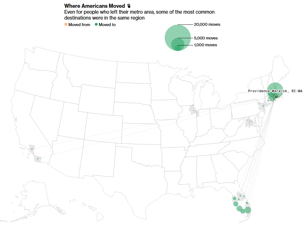
Outside of NYC and the Bay Area, most of the migration inside the United States has been WITHIN metropolitan statistical areas, and usually from the more dense core to the outer fringe. So edge cities, suburbs, exurbs, and micropolitan areas have seen an increase, but many of these moves were simply accelerated by the pandemic. The interactive charts and maps are what make this article an exceptional teaching resource.
Questions to Ponder: How has your area’s demographic profile changed during the pandemic? What are the areas of your state that have been most heavily impacted? When people move from your county, where do they go? Where do migrants into your county come from? What patterns do you see and what explains these patterns? What push and pull factors influence these choices?
Tags: migration, USA, population.


Leave a comment