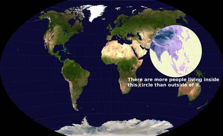
This map called the Valeriepieris Circle became famous about 9 years ago after garnering a ton of attention on Reddit. A cartographer did a deep dive into mapping the smallest circle around the largest percentage of the the global population. The result was dozens of maps, include the Yuxi Circle depicted below. This is such a powerful way to convey how uneven the distribution of global population actually is and opens the door to explore the consequences of population density.
SOURCES: Visual Capitalists, Stats Maps n Pix (deeper dive).
TAGS: cartography, mapping, density, population.


Leave a comment