Search

GEOGRAPHY EDUCATION

Supporting geography educators everywhere with current digital resources.

The history of space exploration mapped

“Humans have dreamed about spaceflights forever but only in the second half of the 20th century were developed rockets that were powerful enough to overcome the force of gravity to reach orbital velocities that could open space to human exploration. The awesome poster called Chart of Cosmic Exploration documents every major space mission starting from the Luna 2 in 1959 to the DSCOVR in 2015. The map traces the trajectories of every orbiter, lander, rover, flyby, and impactor which ever left the Earth’s orbit and successfully completed its mission.”


Tags: space, remote sensing, scale

Source: geoawesomeness.com

D.C. Votes Overwhelmingly To Become 51st State

District of Columbia voters passed the referendum Tuesday with nearly 80 percent in favor. Congress, which will ultimately decide the fate of the federal district, is not expected to approve it.


Voters in the District of Columbia passed a measure on Tuesday in favor of petitioning Congress to become a state in the union.

79 percent of voters cast votes in favor of the ballot measure, which splits the district into a residential state with a small federal district in the middle of it for government buildings and monuments, as we have reported.

The newly approved measure had four parts:

  1. agree that the District should be admitted to the Union as the State of New Columbia
  2. approve of a Constitution of the State of New Columbia to be adopted by the Council
  3. approve the State of New Columbia’s boundaries
  4. agree that the State of New Columbia shall guarantee an elected representative form of government.

Source: www.npr.org

Questions to Ponder: Why do the residents of the District of Columbia want to change the legal status of the District to a state?  Why might some states and politicians NOT want to see a 51st state?  What is needed in the United States to admit a new state (Puerto Rico is still a possibility to become the 51st state)?  


Tags: political, sovereignty, autonomy, Washington DC.

Tornado Alley

Interested in learning about tornado alley? Then you’ll want to read our tornado alley facts and information. Tornado Alley 101

Source: www.tornadofacts.net

This map nicely shows the particular air requirements needed for a tornado to form and why the part of the United States known as Tornado Alley accounts for the majority of the world’s tornadoes.  This nicely shows how physical geographic factors form a major part of how a region might be defined and conceptualized. 


Tags: tornado, physical, weather and climate, visualization, regions.

The Weirdest Town Names In All 50 States

A map produced by real estate website Estately found the weirdest town name for every state in America, including Booger Hole, WV, and Old Roach, CO.

Source: www.thrillist.com

I know, I know.  You have a better name that should be on this map of strange toponyms.   Having driven MANY times from San Diego to Utah, I’m kind of partial to Zzyzx, CA…just because.  What’s you favorite toponym? What value is there is having a strange name for a town?  How does a place name contribute to the local sense of place?   

Tags: place, toponyms.

A More Accurate World Map Wins Prestigious Japanese Design Award

“To design a map of the world is no easy task. Because maps represent the spherical Earth in 2D form, they cannot help but be distorted, which is why Greenland and Antarctica usually look far more gigantic than they really are, while Africa appears vastly smaller than its true size. The AuthaGraph World Map tries to correct these issues, showing the world closer to how it actually is in all its spherical glory.”

Source: mentalfloss.com

This just shows how subjective the concept of “accurate” can be. First off, this is a fabulous map that nicely minimizes distortions (distance, direction, area, and shape) of the land on our planet. Any criticism of the map just shows the impossibility of making an accurate 2D map of a 3D Earth, but I still think that there is plenty of room to discuss the flaws/distortions that were chosen instead of others. It is interesting to note that a Japanese contest awarded this map with it’s top honor (I doubt a Brazilian organization would feel the same way about this map). This map does make with some traditional cartographic conventions in its representation of Earth.  


Questions to Ponder: What are some elements of this map that are different from more traditional maps? This map claims to be more accurate; does that make it more useful?    


Tags: visualization, mapping, cartography, geospatial, technology.

Election Cartograms

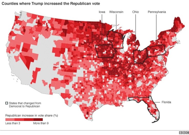
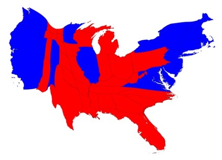
“The states are colored red or blue to indicate whether a majority of their voters voted for the Republican candidate, Donald Trump, or the Democratic candidate, Hillary Clinton, respectively. There is significantly more red on a traditional election maps than there is blue, but that is in some ways misleading: the election was much closer than you might think from the balance of colors, and in fact Clinton won slightly more votes than Trump overall. The explanation for this apparent paradox, as pointed out by many people, is that the map fails to take account of the population distribution. It fails to allow for the fact that the population of the red states is on average significantly lower than that of the blue ones.

We can correct for this by making use of a cartogram, a map in which the sizes of states are rescaled according to their population. That is, states are drawn with size proportional not to their acreage but to the number of their inhabitants, states with more people appearing larger than states with fewer, regardless of their actual area on the ground. On such a map, for example, the state of Rhode Island, with its 1.1 million inhabitants, would appear about twice the size of Wyoming, which has half a million, even though Wyoming has 60 times the acreage of Rhode Island.”


Tags: electoral, scale, politicaldensity, mapping.

Source: www-personal.umich.edu

In The Mountains Of Georgia, Foxfire Students Keep Appalachian Culture Alive

For 50 years, high school students in Rabun County have chronicled their region’s disappearing traditions and mountain people, from blacksmiths to moonshiners, in publications and a living museum.

Source: www.npr.org

This is an excellent, rich example of preserving old elements of rural, folk cultures that are rapidly disappearing.  The project ties local students to the region to appreciate past more and creates a remarkable archive for the future. 


Tagsculture, historicalrural, folk culturesthe Southpodcast, unit 3 culture.

US election 2016: Trump victory in maps

The map above shows where Mr Trump improved on the share of the vote achieved by Mitt Romney, the Republican presidential candidate who failed to beat President Barack Obama in 2012.


Tags: electoral, political.

Source: www.bbc.com

Maps to change how you think about American voters — especially small-town, heartland white voters

Small towns are as Democratic as big cities. Suburban and rural voters are the Republicans.


I have assembled a Web map from precinct-level 2008 election data that allows users to zoom in and out, focus in on specific towns or neighborhoods and superimpose census data on income and race, allowing readers to examine their own favorite postindustrial towns. One of the most striking lessons from exploring these maps is that the red non-metropolitan counties on election-night maps are internally heterogeneous, but always following the same spatial pattern: Democrats are clustered in town centers, along Main Street, and near the courthouses schools, and municipal buildings where workers are often unionized. They live along the old railroad tracks from the 19th century and in the apartment buildings and small houses in proximity to the mills and factories where workers were unionized in an earlier era.

Source: www.washingtonpost.com

There have been SOOOO many articles about the 2016 election, what happened, why it happened and how particular demographics voted and why.  Most of these articles are highly partisan, or ideologically informed but this just analysis of past spatial voting patterns  (I am waiting for the updated version of these maps to show what happened in 2016–but I’m thinking some of this changed).  Too often we’ve lumped the geography of small towns and rural areas as though they are one and the same.  Too often will only see electoral maps with state-level voting data or possibly county level data; but the sub-county scale reveals what would otherwise be missing in our assessment of electoral, spatial patterns (Scale matters?  Who knew?)


Tags: electoral, scale, political, mapping.

Create a free website or blog at WordPress.com.

Up ↑