Search

GEOGRAPHY EDUCATION

Supporting geography educators everywhere with current digital resources.

The Vatican’s Gallery of Maps Comes Back to Life

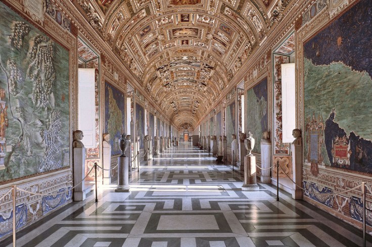
In the 16th century, Pope Gregory assigned the monk and geographer Ignazio Danti to carry out the project. In turn, Danti hired several artistic stars of the day and up-and-comers as well to illustrate the maps, including Girolamo Muziano, Cesare Nebbia and the Flemish brothers Matthijs and Paul Bril. The Brils excelled at landscape paintings—an essential skill for the work.

Source: www.wsj.com

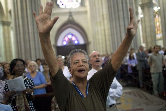
This 4-year restoration project is a great cultural revival, but it also reveals the importance of geographic information.  The Vatican was a great medieval seat of both religious authority and political power.  This attracted prominent visitors from all over Europe and the map gallery served to convey geographic information about the Italian peninsula.  


Tagsart, Italy, historical, Europe, religiontourism, Christianity.

Trailer: One Day on Earth

//cdn.embedly.com/widgets/media.html?src=https%3A%2F%2Fplayer.vimeo.com%2Fvideo%2F26378195&wmode=opaque&url=https%3A%2F%2Fvimeo.com%2F26378195&image=http%3A%2F%2Fi.vimeocdn.com%2Fvideo%2F215566910_1280.jpg&key=359ed8ab27db4f02a128049b1f89d6a1&type=text%2Fhtml&schema=vimeo

One Day on Earth is a unique global movement, community media creation platform, and collaborative film production engine. We invite you to join our international community of thousands of filmmakers, hundreds of schools, and dozens of non-profits, and contribute to this unique global project (with a map of all participants). Many future filming events will be announced in the coming year. One Day on Earth is a community that not only watches, but participates.”


Tagsvideo, mapping, social mediaplaceculture.

Source: vimeo.com

When Mexico Was Flooded By Immigrants

In the early nineteenth-century, Mexico had a problem with American immigrants.

Source: daily.jstor.org

A century and a half ago, the immigration debate and geopolitical shifts in power on the United States-Mexico border reflected a profoundly different dynamic than it does today.  This history has enduring cultural impacts on southwestern states that had the international border jump them.


Tags: culture, demographicsmigration, North Americahistorical, colonialism, borders, political.

#GeoEdu16 Research from Routledge

As the proud publisher of both Journal of Geography and The Geography Teacher, the official publications of the National Council for Geographic Education, we couldn’t be more excited to join the NCGE in Tampa for #GeoEdu16. We will be offering NCGE members and attendees FREE ACCESS to specially selected content which reflects core themes of this special meeting: AP Human Geography, Race and Ethnicity, Climate Change and Human Migration, Coastal Geography, Geospatial Technology in the Classroom, Electoral Geography, and National Park Service!

Source: explore.tandfonline.com

The National Council for Geographic Education is having their 101th conference this week (#GeoEdu16).  The Journal of Geography and The Geography Teacher are fabulous resources produced by NCGE for geography educators (and great reasons to become a member of NCGE).  The recent APHG special edition is among the free downloads that will be available through the end of this year, so start downloading!  


Tags: NCGEAPHG, geography education, teacher training.

The dirty little secret that data journalists aren’t telling you

How to tell two radically different stories with the same dataset.

Source: www.washingtonpost.com

Mapping matters, but that doesn’t mean that maps convey an objective truth.  They are rhetorical devices used to convince and persuade.  So approach maps critically because while they can convey great spatial patterns, they can conceal patterns just as easily.  


Tagsstatisticscartography, visualization, mapping.

Surging Seas Interactive Map

Global warming has raised global sea level about 8″ since 1880, and the rate of rise is accelerating. Rising seas dramatically increase the odds of damaging floods from storm surges.

Source: sealevel.climatecentral.org

This interactive map from Climate Central dramatically shows what locations are most vulnerable to sea level rise.  You can adjust the map to display anywhere from 1 to 10 feet of sea level rise to compare the impact to coastal communities.  This dynamic map lets to view other layers to contextualize potential sea level rise by toggling on layers that include, population density, ethnicity, income, property and social vulnerability.   


Tags: physical, weather and climate, climate change, environment, resources, watercoastalmapping, visualization, environment depend, political ecology.

Half the World Lives on 1% of Its Land, Mapped

“Data viz extraordinaire Max Galka created this map using NASA’s gridded population data, which counts the global population within each nine-square-mile patch of Earth, instead of within each each district, state, or country border. Out of the 28 million total cells, the ones with a population over 8,000 are colored in yellow.”


Tags: population, density, mapping, visualization.

Source: www.citylab.com

Why the Catholic Church is losing Latin America, and how it’s trying to get it back

“A religious revolution is underway in Latin America. Between 1900 and 1960, 90% of Latin Americans were Catholics. But in the last fifty years, that figure has slumped to 69%, according to a recent survey by the Pew Research Center (from which most of the data in this article are taken). The continent may still be home to 425 million Catholics—40% of the world’s total—but the Vatican’s grip is slipping.”


Tags: culture, religionChristianityMiddle America, South America.

Source: qz.com

These Maps Show How Vast New Infrastructure Is Bringing the World Together

“If you want to understand the world of tomorrow, why not just look at a good map? For my (Parag Khanna) new book, Connectography, I researched every single significant cross-border infrastructure project linking countries together on every continent. I worked with the world’s leading cartography labs to literally map out what the future actually — physically — will look like.

It turns out that what most defines the emerging world is not fragmentation of countries but integration within regions. The same world that appears to be falling apart is actually coming together in much more concrete ways than today’s political maps suggest. Major world regions are forging dense infrastructural connectivity and reorienting their relations around supply chains rather than borders.”


Tags: regionsmap.

Source: www.huffingtonpost.com

Blog at WordPress.com.

Up ↑