Search

GEOGRAPHY EDUCATION

Supporting geography educators everywhere with current digital resources.

Tag

mapping

Mapping the World’s Migration Flows

Visualizing the flow of the world’s migrants from country to country.


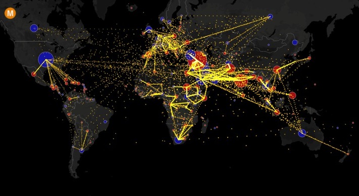
Based on data from the U.N. Population Division, this map shows the estimated net migration (inflows minus outflows) by origin and destination country between 2010 and 2015.

Blue circles = positive net migration (more inflows). Red circles = negative net migration (more outflows). Each yellow dot represents 1,000 people.

Hover over a circle to see that country’s total net migration between 2010 and 2015. Click a circle to view only the migration flows in and out of that country.

For more info about this map, read the article, All the World’s Immigration Visualized in 1 Map.


Tags: migration, USA, mapping, population, unit 2 population.

Source: metrocosm.com

America’s ‘Megaregions’ using Commuter Data

New maps use math to define the amorphous term.

Source: www.citylab.com

By now I’m sure many of you have seen some iteration of this research and data visualization circulating through social media outlets (you can see the article from City Lab, Atlas Obscura or an urban planning program).  We use terms like the greater metropolitan area to express the idea that areas beyond the city boundaries and even beyond the metropolitan statistical areas are linked with cities.  These ‘mega-regions’ are in part the hinterlands of a city, a functional region where the cities act as hubs of economic regions.   

Tags: regions, urban, transportationeconomicvisualization, mapping, USA, planning.

This Sheep Is Mapping The Faroe Islands By Wandering Around With A Camera

How do you get Google to visit your small, remote island group with its Street View vehicles, and digitize your roads for the benefit of locals and tourists alike? If you are the Faroe Islands, then you exploit your local resources to roll your own Street View, in the hopes of attracting Google’s attention. Behold: Sheep View 360, a solar-powered 360-degree camera, mounted on a sheep’s back. Sheep View takes advantage of one great Street View feature: You can upload your own images to Google’s service. So Durita Dahl Andreassen, working for the tourist site Visit Faroe Islands, decided to kick-start the Faroe Islands’ entry by putting the camera on a sheep and letting it wander free, then uploading the photos.”

Source: www.fastcoexist.com

I think this is my favorite mapping story of the year…I’m sharing this just because I can.  Google wouldn’t originally bring its Street View-recording cars to the islands (part of Denmark), so a solar-powered, ovine-mounted camera was put to work.  Fact can be stranger than fiction.


Tags: google, mapping, cartography, technology, Denmark,

Human Population Through Time

It took 200,000 years for our human population to reach 1 billion—and only 200 years to reach 7 billion. But growth has begun slowing, as women have fewer babies on average. When will our global population peak? And how can we minimize our impact on Earth’s resources, even as we approach 11 billion?

Source: www.youtube.com

As stated in a Vox article, “The video above, from the American Museum of Natural History, shows essentially all of human history in just six minutes. It shows humanity spreading across the world over a few hundred thousand years — even as our population remained under 1 million. After that came the rise and fall of many empires and civilizations, plagues, wars, and so on — all the way to our current population of around 7 billion.”  Admittedly, the video is a bit “slow” in the middle, but that is a major part of the story of human population growth, and only serves to show how dramatic the population growth is at the end.  This video brings up more questions than it has answers.


Tags: demographicsmappingmigration, populationhistorical, unit 2 population 

How to Create an Interactive Map with Visme

A step-by-step tutorial on how to create an interactive map with Visme, a free online infographic and presentation tool.

Source: blog.visme.co

If you have students use Piktochart to create infographics, then this is a new tool that you should consider.  In addition to creating infographics, this allows users to create and embed interactive maps in those infographics.  This is a both a baby-step into the world of GIS as well as a way to create student projects that are richly informative.


TagsAPHG, infographic, visualization, mapping, GIS, edtech.

A More Accurate World Map Wins Prestigious Japanese Design Award

“To design a map of the world is no easy task. Because maps represent the spherical Earth in 2D form, they cannot help but be distorted, which is why Greenland and Antarctica usually look far more gigantic than they really are, while Africa appears vastly smaller than its true size. The AuthaGraph World Map tries to correct these issues, showing the world closer to how it actually is in all its spherical glory.”

Source: mentalfloss.com

This just shows how subjective the concept of “accurate” can be. First off, this is a fabulous map that nicely minimizes distortions (distance, direction, area, and shape) of the land on our planet. Any criticism of the map just shows the impossibility of making an accurate 2D map of a 3D Earth, but I still think that there is plenty of room to discuss the flaws/distortions that were chosen instead of others. It is interesting to note that a Japanese contest awarded this map with it’s top honor (I doubt a Brazilian organization would feel the same way about this map). This map does make with some traditional cartographic conventions in its representation of Earth.  


Questions to Ponder: What are some elements of this map that are different from more traditional maps? This map claims to be more accurate; does that make it more useful?    


Tags: visualization, mapping, cartography, geospatial, technology.

Election Cartograms

“The states are colored red or blue to indicate whether a majority of their voters voted for the Republican candidate, Donald Trump, or the Democratic candidate, Hillary Clinton, respectively. There is significantly more red on a traditional election maps than there is blue, but that is in some ways misleading: the election was much closer than you might think from the balance of colors, and in fact Clinton won slightly more votes than Trump overall. The explanation for this apparent paradox, as pointed out by many people, is that the map fails to take account of the population distribution. It fails to allow for the fact that the population of the red states is on average significantly lower than that of the blue ones.

We can correct for this by making use of a cartogram, a map in which the sizes of states are rescaled according to their population. That is, states are drawn with size proportional not to their acreage but to the number of their inhabitants, states with more people appearing larger than states with fewer, regardless of their actual area on the ground. On such a map, for example, the state of Rhode Island, with its 1.1 million inhabitants, would appear about twice the size of Wyoming, which has half a million, even though Wyoming has 60 times the acreage of Rhode Island.”


Tags: electoral, scale, politicaldensity, mapping.

Source: www-personal.umich.edu

Maps to change how you think about American voters — especially small-town, heartland white voters

Small towns are as Democratic as big cities. Suburban and rural voters are the Republicans.


I have assembled a Web map from precinct-level 2008 election data that allows users to zoom in and out, focus in on specific towns or neighborhoods and superimpose census data on income and race, allowing readers to examine their own favorite postindustrial towns. One of the most striking lessons from exploring these maps is that the red non-metropolitan counties on election-night maps are internally heterogeneous, but always following the same spatial pattern: Democrats are clustered in town centers, along Main Street, and near the courthouses schools, and municipal buildings where workers are often unionized. They live along the old railroad tracks from the 19th century and in the apartment buildings and small houses in proximity to the mills and factories where workers were unionized in an earlier era.

Source: www.washingtonpost.com

There have been SOOOO many articles about the 2016 election, what happened, why it happened and how particular demographics voted and why.  Most of these articles are highly partisan, or ideologically informed but this just analysis of past spatial voting patterns  (I am waiting for the updated version of these maps to show what happened in 2016–but I’m thinking some of this changed).  Too often we’ve lumped the geography of small towns and rural areas as though they are one and the same.  Too often will only see electoral maps with state-level voting data or possibly county level data; but the sub-county scale reveals what would otherwise be missing in our assessment of electoral, spatial patterns (Scale matters?  Who knew?)


Tags: electoral, scale, political, mapping.

How Eratosthenes calculated the Earth’s circumference

“In the mid-20th century we began launching satellites into space that would help us determine the exact circumference of the Earth: 40,030 km. But over 2000 years earlier, a man in Ancient Greece came up with nearly the exact same figure using just a stick and his brain.”

Source: www.youtube.com

Eratosthenes is often referred to as the “father of geography” for creating meridians and parallels on his maps to organize global information, classifying climatic zones, and as shown in the video, calculating the circumference of the Earth. Plus, he coined the terms so he gets the credit. If you have never pondered the meaning of the word “geometry,” the accomplishments of Eratosthenes will certainly show that the mathematical prowess was at the heart of expanding our collective geographic knowledge (additionally, here is a retro Carl Sagan in a video clip from Cosmos that inspired this clip).    


Tagsmapping, math, locationSTEM, historical.

Blog at WordPress.com.

Up ↑