Search

GEOGRAPHY EDUCATION

Supporting geography educators everywhere with current digital resources.

Tag

mapping

Election maps are telling you big lies about small things

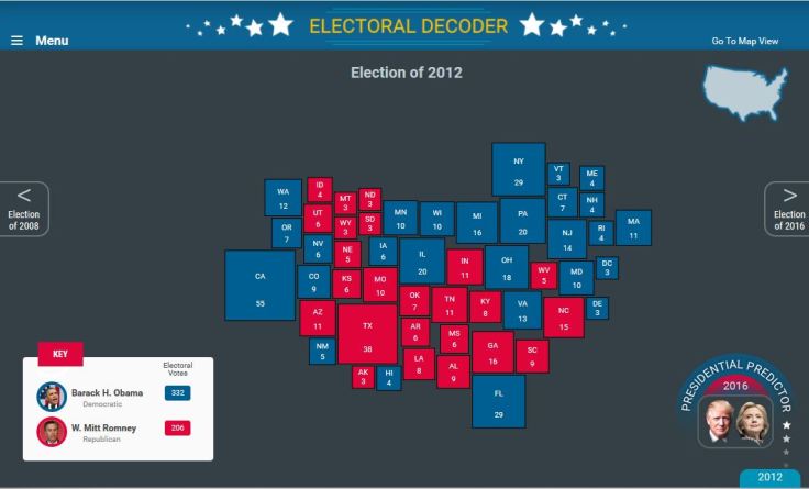
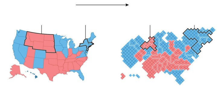
In 2012, 160 counties cast about the same number of votes as the rest of the country. But, your run-of-the-mill election map won’t show you that.

Source: www.washingtonpost.com

This is nothing new to most visitors to this site, but every four years we have a wonderful teaching moment to show how population density can change our interpretation of a map and the meaning of the data embedded in that map.  I preparation for next week, this article for the Washington Post as well as this one from the New York Times should help get students be better prepared for the onslaught of maps that we know are right around the corner, to properly assess and contextualize the geographic content in these maps.     


Tags: electoral, political, mapping.

Speaking the “Language” of Spatial Analysis

“Spatial analysis has always been a hallmark of GIS, the ‘numerical recipes’ which set GIS apart from other forms of computerized visualization and information management. With GIS we pose questions and derive results using a wide array of analytical tools to help us understand and compare places, determine how places are related, find the best locations and paths, detect and quantify patterns, and even to make spatial predictions.”

Source: blogs.esri.com

GIS is a key tool in spatial analysis, but it can also be a driving force in using math, science, technology and (yes) geography as interdisciplinary ways of teaching the curriculum.  StoryMaps can be rich with images and videos, but also filled with data at a variety of scales.  ESRI has share a “Maps we love” page with excellent examples of Story Maps and carefully explains WHY these maps work and HOW they were made.  Are you new to using the Analysis tool in ArcGIS Online?  Try this exercise on analyzing flood risk to guide you through some of the steps to learn what is possible for a project of your own.  What stories can you tell in this rich, visual format?  What visual template shown might lend itself best for that sort of project? 


Tagsmapping, GISESRIgeography education, geospatial, edtech.

What This 2012 Map Tells Us About America, and the Election

History, race, religion, identity, geography: The 2012 election county-level map has many stories to tell, including about the 2016 race.

Source: www.nytimes.com

The coverage of this election feels less objective than in past years (maybe that’s just my perception, but that is why I’ve shared less electoral resources than in past years).  This article show’s good map analysis and electoral patterns without much of any ideological or partisan analysis of the political platforms.  


Tags: electoral, political, mapping.

Visualizing Exotic Travels

Source: www.youtube.com

When I watched this cartographic depiction of Indiana Jones’ adventures in Raiders of the Lost Ark as a kid, I was fascinated by the power of the map they used to segue between scenes.  It heightened the level of mystery and intrigue; I felt as if a whole new world was opening up as I was living vicariously through Dr. Jones.  This movie and its maps instilled in me a passion for global adventure, or at least a desire to learn about far off places…so get out there and explore.


Tagsmobilitytransportationtourismmapping, place.

Country Cluster Quiz

“No borders. No landmarks. No context. How many countries will you be able to recognize? Here’s how this works. I give you a the outline of several countries together, without borders or any other context, and you guess which countries you’re looking at.”

Source: www.buzzfeed.com

This is not the most difficult geography quiz (as advertised on Buzzfeed), but it does take some time since all the countries in a given cluster aren’t all immediately obvious.  The fact that it is multiple choice certainly simplifies the this quiz.


Tagsmapping, trivia, funborders.

Hurricane Matthew-Humanitarian Mapping

“The Humanitarian OpenSteetMap Team (HOT) has activated to provide geographic base data in areas affected by Hurricane Matthew. Category 4 Hurricane Matthew continues to strengthen and is advancing on Haiti and the Bahamas. Hurricane Matthew is expected to cause ‘catastrophic‘ damage including extreme flooding and landslides potentially affecting millions in Haiti, Jamaica, and Bahamas. To start we are mapping coastal communities in the storm path.”

Source: hotosm.org

Want to see geographic knowledge and geospatial skills in action?  Crowd-sourced mapping is increasingly an important resource during an emergency.  Poorer places are often not as well mapped out by the commercial cartographic organizations and these are oftentimes the places that are most vulnerable to natural disasters.  Relief agencies depend on mapping platforms to handle the logistics of administering aid and assessing the extent of the damage and rely on these crowd-sourced data sets.  My students and I are working on this over the weekend; can you join in and help?  The projects that are marked urgent by the Red Cross are all in Haiti right now.  Here are is a video playlist that explains the project and how you can help if you are new to OpenStreetMap (OSM).


Tags: disasters, mappingSTEM, physicalHaiti, weather and climate.

Why Hurricane Categories Make a Difference

During a hurricane you usually hear meteorologists refer to its intensity by categories. If you don’t know the difference between a category 1 and a category 5 hurricane, The Weather Channel meteorologist Mark Elliot breaks it down for you.

Source: www.youtube.com

With Hurricane Matthew having just hit Haiti (video) and Cuba, it now poised to strike Florida. Many are unsure what the term “category 4” actually means because they are unfamiliar with the Saffir-Simpson Hurricane Wind Scale.  This video is a good introduction to what this means to people in the path of the hurricane. As we monitor this (and future) situation, these are my favorite digital globes that display wind speeds and a few other of Earth’s physical systems. What is beautiful and majestic from one scale can be horrific and catastrophic at another:    


Tagsphysical, weather and climatedisasters, mapping, visualization.

Historic Aerial Mapper

“This application was developed by The Providence Plan utilizing photos from the Rhode Island Geographic Information System.”

Source: mapper.provplan.org

This map is a great archive of historic satellite imagery of the Ocean State, with a special nod to Providence.  This is a great tool that can be used to show how and particular place in Rhode Island has changed over the years at the neighborhood scale.  At the metropolitan scale, it is easy to see the population grown, development expansion, and urban sprawl.  The years of data coverage are 1939, 1952, 1962, 1972, 1981, 1985, 2003, 2008, 2011, and 2014.    


Tags: mapping, Rhode IslandESRIStoryMap, GIS, remote sensing.

PBS Election Central

Check out Election Central from PBS with tools, resources & solutions to engage students in the political process.

Source: www.pbseduelectioncentral.com

The first presidential election last night has intensified the already polarized political conversation in the United States. This is a great resource to explore historic political maps and cartograms.  It also has rich tools to project the possibilities for the 2016 election with ready-made lesson plans. 


Tags: electoral, politicalhistorical, mapping.

Blog at WordPress.com.

Up ↑